Learnings from some of the best PWAs - Part 1
Introduction
The observation which drove me to do this analysis is, although Flipkart/Amazon is spending so much effort on its web presence, still it shows a prompt to the user when they land on the web app to “Open in an app”. I want to understand how do web-apps perform, good/bad compared to apps and what are the general UI components used for creating apps.
User stickiness is better with apps, the reason is apps can spam the user with notifications and “interesting” banners. User engagement will ensure people will use the app more often.
Some observations around PWAs
👉 To install a web app as a PWA, a service worker is needed. While the user interacts with the app the browser prompts the user to install the app on the home screen. This is the default browser behavior, but with this, we somehow rely on the browser to take care of installing the app.
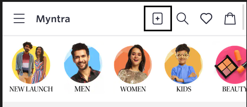
What Flipkart does well in this regard is, it provides a click-to-install button on the top and the user can click on it and trigger the installation process. I like it because it adds another level of control instead of being in the fates of the browser.

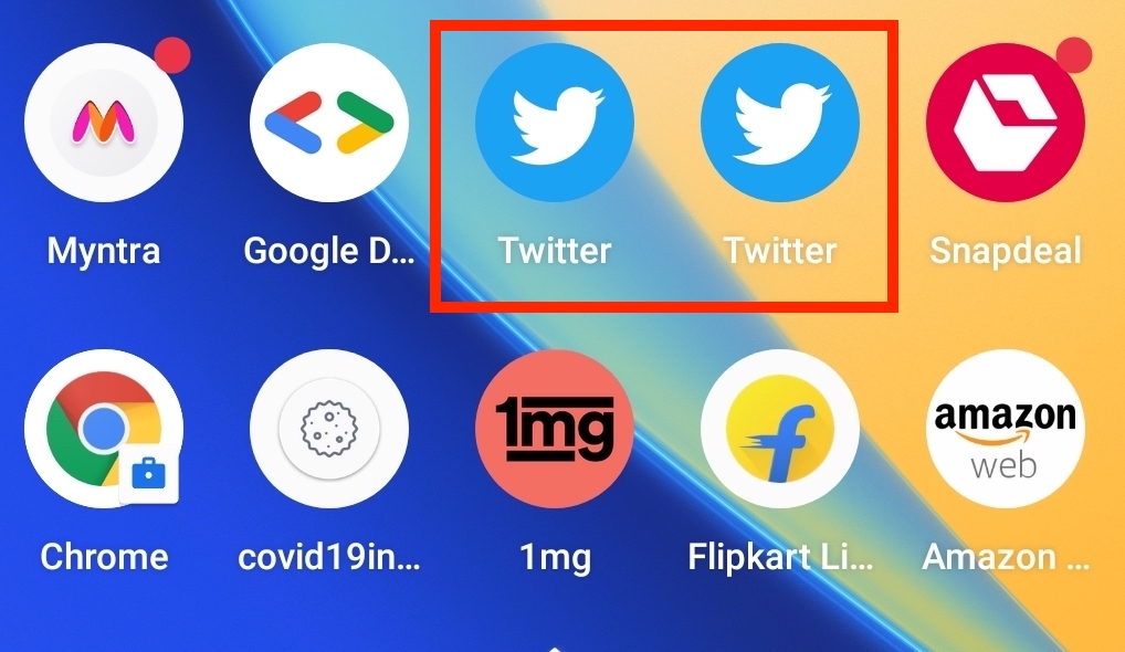
👉 The icons of the installed PWA and regular apps, are absolutely the same on Android. One cannot differentiate between them.
Just like native PWAs can also have badges on icons. I observed Myntra and Snapdel show badges just like native apps.

👉 Pharmeasy just opens the native app when I click on the Pharmeasy link on Chrome, so they do not want the user to try their msite at all.
👉 Amazon, Flipkart, 1mg, most of the sites, while the user is on the msite they are prompting the user to try their native apps. It seems they are putting more bet on native apps compared to PWAs.
👉 Apps need location access to understand where the users are and provide a better experience. For example, if Flipkart knows that the user is in Bangalore then Flipkart can show better recommendations.
I have seen 1mg ask for location access immediately once I opened the app.
👉 The splash screen of PWAs is bad, this needs improvement. The good part is it is fast, usually faster to load than native apps.
This is understandable as loading PWAs is like loading around 1MB (max) of assets as compared to an app that tries to load in several MBs of data.
👉 Even in PWA a banner prompting the user to open in-app appears.
For example 1mg where a top banner always comes.
👉 When using the dark mode the status bar color is always black. This is not the case when the theme is light.
Apps do not face this issue. I feel this is holding back PWAs a bit.

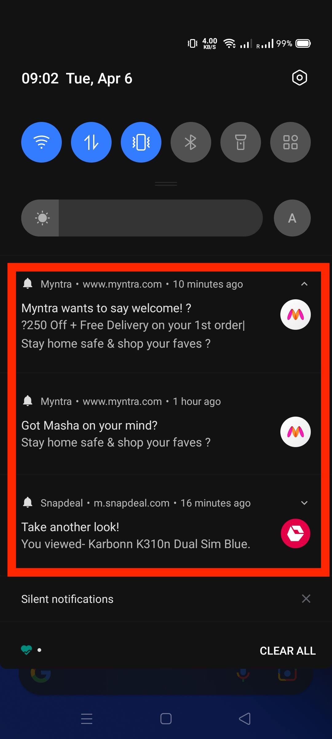
👉 The notifications that are shown in the case of APPs are better as there is more customizability whereas the notifications shown by PWAs are basic.
Actually, for PWAs the notifications are self-contained, as in “chrome” or any other browser vendor is not mentioned, this is good IMO.
The same is not the case with apps. Also, apps need not ask for permission for push notifications, PWAs need that. Hence apps feel more natural.
Notifications for PWAs are always coming as a bell 🔔 icon, whereas for apps it comes as the app icon.

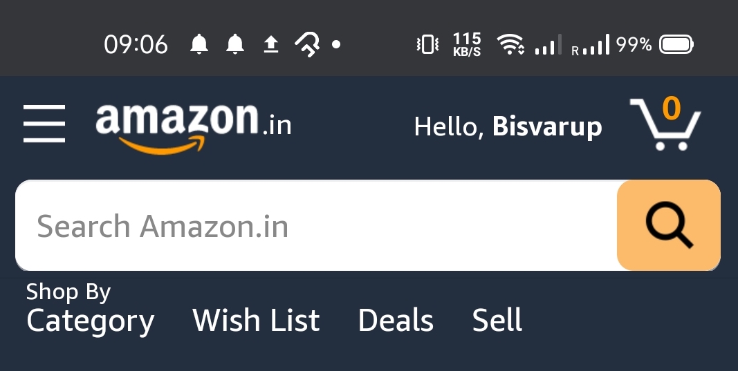
👉 Sometimes PWAs mix two experiences of loading inside PWA and as webpages, saw this with Amazon.
I get it from a business point of view maybe they are built with different teams and they are on different paths, but overall it looks bad.
Summarizing
So to list down the point which you should consider for your next PWA
- Having a service worker and a click-to-install button.
- Having good quality icons like the ones used by native.
- Having badges on the icons to hint the user something is there.
- Do not show install native app if the user is already using your PWA.
- Consider and plan for the dark theme as discussed above.
- Send notifications to your users, it is very powerful for engagement.
- Do not mix PWA experience with vanilla browser experience.
- User intersection observer to detect if an image should be rendered.
- User the PRPL pattern.
- Try using a cache first approach.